No products in the cart.
Blog
Don’t Worry About Matching: Why Contrasting Clothing Labels Work

18
Mar
Mar
How Contrasting Clothing Labels Boost Brand Recognition (And When to Use Them)
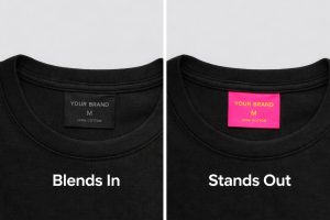
Contrasting clothing labels are commonly used in apparel branding to help clothing brands stand out. Instead of blending into the garment, these labels use color differences to create visibility, improve brand recognition, and make products more memorable.
Think about the brands you instantly recognize. Sometimes it’s not just the logo—it’s the label itself. The color, placement, and contrast of clothing labels can play a major role in how a brand is recognized and remembered.
That’s where contrasting clothing labels come in.
What Are Contrasting Clothing Labels?
Contrasting clothing labels are labels designed to stand out from the garment by using different colors, tones, or finishes. Instead of blending in, they create visual separation that can make a clothing brand more noticeable and memorable.
Why Contrasting Clothing Labels Work
For years, clothing labels were designed to blend in—black on black, white on white, subtle and safe.
Not anymore.
Modern brands are intentionally using contrasting clothing labels to stand out, grab attention, and create memorable branding moments.
And it works.
High Visual Impact That Sticks
Let’s be honest—what are you more likely to remember?
A beige label on a tan shirt…
or a bold neon label on a neutral garment?
Exactly.
Contrast creates instant visual impact, and that’s what makes customers pause, notice, and remember.
Whether it’s:
a bright woven label on dark fabric as a simple example of contrasting clothing labels
or a pop-color hangtag
👉 Contrast = attention.
Stronger Brand Recognition
Color plays a massive role in how people recognize and remember brands.
Studies show that people form opinions about products within seconds—and color is a major factor in that decision.
When you consistently use contrasting label colors, you create:
a recognizable identity
a repeat visual cue
a signature look
Even if someone forgets your name, they may still recognize your product by your label style.
Use Color to Communicate Your Brand
Color isn’t just visual—it’s psychological.
Different colors send different messages:
Blue → trust, reliability
Yellow → energy, optimism
Red → boldness, urgency
Black → luxury, authority
By using contrasting labels, you can inject meaning directly into your product, without saying a word.
Stand Out in a Crowded Market
Let’s face it—there’s a lot of clothing out there.
Most brands still play it safe with label design.
That’s your opportunity.
A contrasting label:
draws the eye instantly
differentiates your product
adds perceived value
Even something as simple as a bright tag inside a neutral garment can elevate your entire presentation.
When Contrast Works (And When It Doesn’t)
Let’s not go crazy here—contrast is powerful, but it needs intention.
✅ Works well when:
you want to stand out
your brand has a bold or modern identity
you’re targeting younger or trend-driven audiences
⚠️ Be careful when:
your brand is luxury/minimalist. Consider using a bold outer brand label and a soft satin printed label on the inside to convey care and content.
contrast clashes with your overall aesthetic
readability suffers
Bottom line: contrast should feel intentional, not accidental.
The Bottom Line
Contrasting clothing labels are not just a design choice—they are a branding decision that can directly impact how your apparel is recognized and remembered.
In fact, some of the most memorable brands use contrast to create identity, recognition, and emotional impact.
If you’re designing clothing labels, don’t be afraid to experiment.
A small pop of contrast could be the detail that makes your brand unforgettable.